Model Dashboard
The Model Dashboard provides a centralized, high-level overview of all LLM activity across Kompass. It aggregates real-time metrics for every model call made by your Projects, workflows, and agents, allowing teams to monitor usage behaviors, track operational expenditures, and identify performance anomalies.
Key Performance Cards
At the top of the dashboard, high-level metric summaries offer an immediate health check of your LLM integrations over a selected billing or observation period.
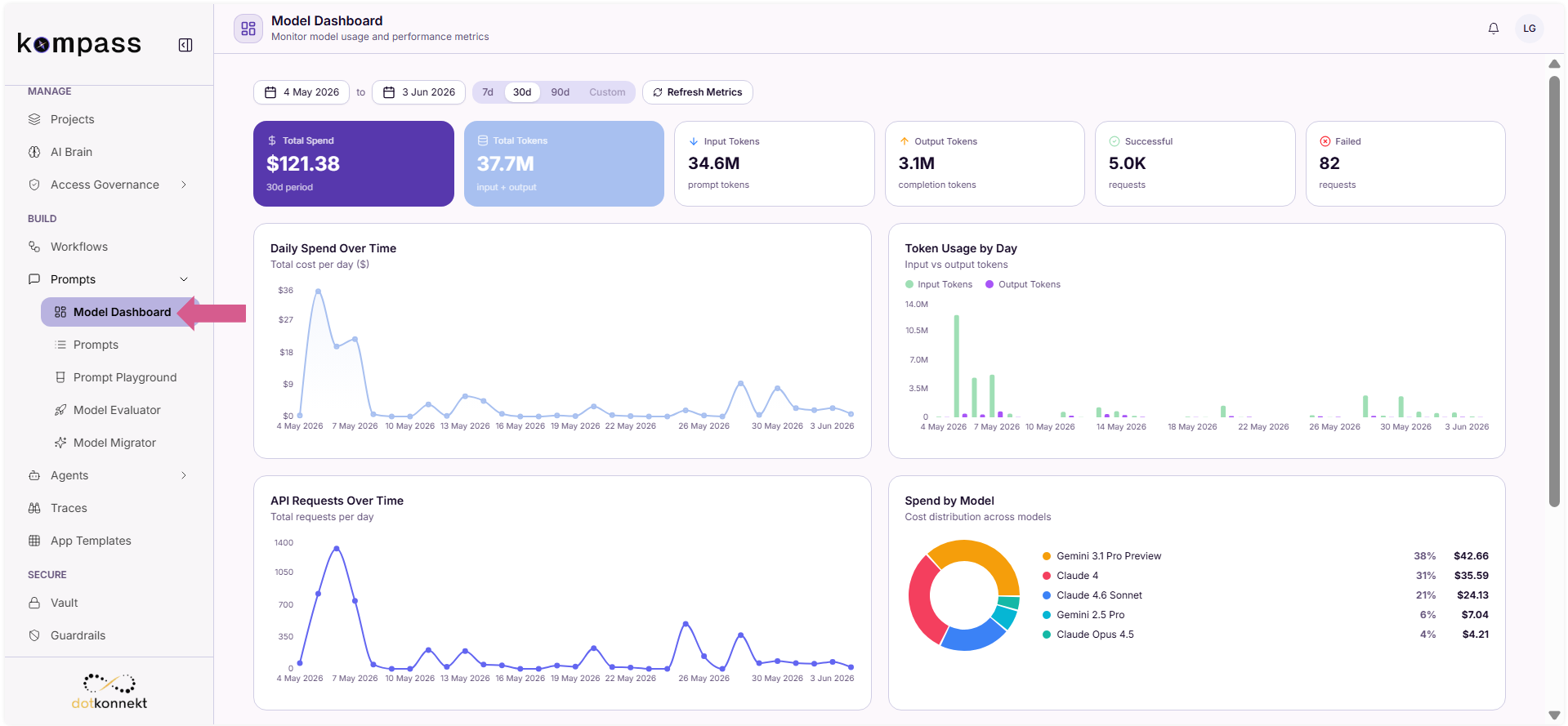
- Total Spend: Displays the total financial investment accrued across all active models within the designated date range.
- Total Tokens: Represents the aggregate volume of both data inputs sent and text completions received by the platform.
- Input Tokens: Tracks the specific volume of prompt tokens ingested by downstream LLM providers.
- Output Tokens: Tracks the specific volume of completion tokens generated by the models.
- Successful: Measures the total volume of successfully resolved API requests.
- Failed: Identifies the total count of failed requests, pointing out potential timeout errors, rate-limiting hurdles, or credential failures.
Pro Tip
Keep an eye on the Failed request tile. A sudden spike in failures while Total Spend flattens out usually signals an upstream provider outage or an unhandled rate limit issue inside an active agent pipeline.
Operational Analytics and Trends
The middle section of the dashboard splits metric tracking into distinct visual timelines, showing daily operational habits and spending behavior.
Daily Spend Over Time
This linear trend graph tracks chronological financial distribution. It highlights exactly when usage spikes happen, making it easy to align infrastructure costs with real-world user activity.
Token Usage by Day
A clustered bar visualization that distinguishes input tokens from output tokens on a daily basis. This is helpful for understanding your context-to-completion ratios.
API Requests Over Time
This section tracks the raw frequency of LLM calls over your selected time horizon, providing visibility into traffic fluctuations and system load patterns.
Spend by Model
A comparative donut chart breaking down your budget consumption by individual foundational models. This graph exposes exactly which models are driving your platform costs.
Granular Model Breakdowns
The lower segment of the dashboard offers deep-dive visibility into per-model distributions across spending, token usage, and individual API request counts.
Hover over any specific day within the Model Breakdown multi-bar charts to reveal a localized data overlay.
Analyze the Three-Way Split
Review your system performance across the three core operational graphs:
- Spend ($): Shows which specific model architectures are driving daily costs.
- Tokens: Tracks individual model token consumption, helping you spot heavy text processing tasks or bloated prompt contexts.
- Requests: Tracks call volumes per model to help you understand traffic distribution across your orchestration layers.
Pro Tip
If your Tokens chart shows high volumes for premium models like Claude 4 or Gemini 3.1 Pro Preview, but your Requests count is relatively low, your system might be dealing with long prompt contexts or multi-turn chat storage. Consider implementing aggressive context caching or moving lighter tasks over to faster, cheaper variants like Gemini 3.1 Flash Lite.
Summary
The Model Dashboard serves as your operational command center for keeping AI systems stable and cost-effective by tracking:
- Overall consumption metrics (Spend, Tokens, Request Success).
- Daily operational spend, volume changes, and provider traffic patterns.
- Comprehensive cost allocation breakdowns by foundational model.
- High-resolution, day-by-day metrics via interactive multi-variable charts.